



Personal Branding
Programs Used: Illustrator, After Effects
Project Origin: Personal
Project Audience: Clients, Employers
Project Deliverables: Business Cards, Stationery, Website
Project Purpose: Personal Brand Identity
Year Completed: 2026
What's in a logo?
That's a question I had to ask myself as I began to create the logomark that defines who I am - optimistic, creative, yet austere, and this logo exemplifies those traits.
Here's a look into how I dreamt it up and how the ideas evolved into something greater through careful refinement.

Inspiration
The root of the word "inspire" comes from Latin "to breathe life into". That is precisely what my personal aesthetic and branding intend to convey: to breathe life into my work.
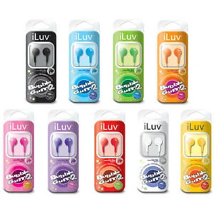
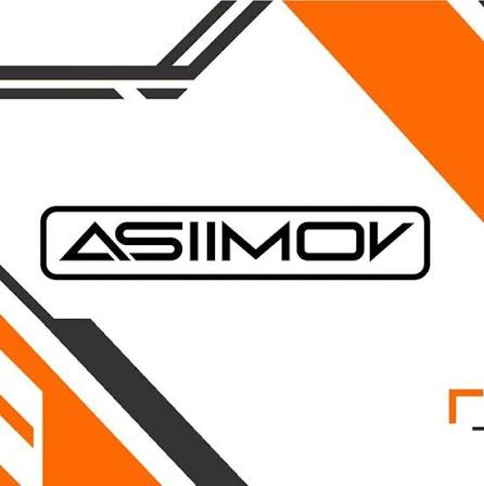
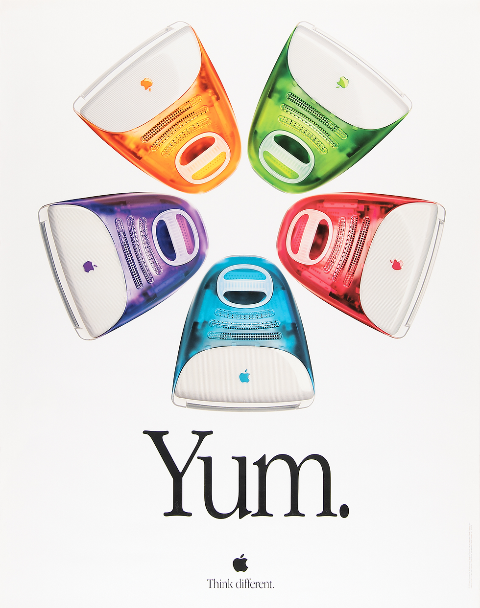
A wide range of things inspire me, and by extension, this logo - mainly, the bright tertiary colors and curvilinear forms of the early 2000s, as well as a multitude of sci-fi media.
HEX
000000
RGB
0 0 0
CMYK
0 0 0 100
HEX
d57d2d
RGB
213 125 45
CMYK
0 41 79 16
HEX
ffffff
RGB
255 255 255
CMYK
0 0 0 0
Colors
Orange is the color of creativity and optimism, and white in many cultures is the color of purity, goodwill, and simplicity. This tangerine-like orange is saturated enough to be interesting, but not washed-out enough to belong on a safety cone you'd see at a construction site.
Black balances both out, and helps text and tertiary elements stand out at a distance, a simple and harmonious palette.
Gotham Bold
Aa Bb Cc Dd Ee Ff Gg Hh Ii Jj Kk Ll Mm Nn Oo Pp Qq Rr Ss Tt Uu Vv Ww Xx Yy Zz
0123456789!@#$%&()
Gotham Book
Aa Bb Cc Dd Ee Ff Gg Hh Ii Jj Kk Ll Mm Nn Oo Pp Qq Rr Ss Tt Uu Vv Ww Xx Yy Zz
0123456789!@#$%&()
Type Kit
Gotham is a font family closely related to Helvetica, but is a tad wider, as well as offering a warmer, more welcoming field than its architectural, business-like Swiss counterpart.
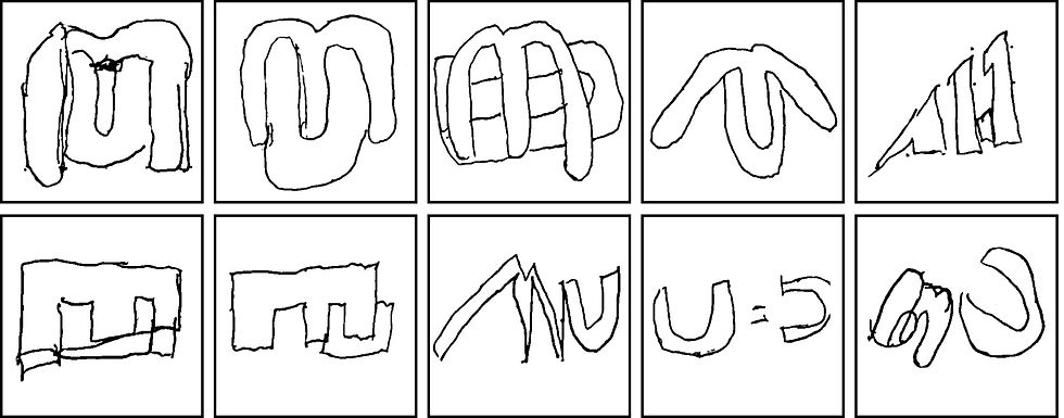
Sketches
It was time to mess around with forms - there’s a multitude of ways to mess around with my initials, but I was set on a couple ideas that I knew would be most likely to succeed.

Digital Drafts
As soon as I got the idea to fit the M inside the U and keep it curvilinear, I knew I had what was likely the final product, but I still explored other potential outlets to play around with a monogram - from blocky to angular, they were still interesting explorations to discover.

Logomark
The smooth rounded forms slotting into one another exemplify creativity, warmth, and professionalism.

Pattern
The rotated logomark repeated along a grid creates a “flock of birds” effect that shows how it works in a group.

Lockups
A good logo fits in a multitudinous way. Different lockups and alignments are essential to use a logo across any foreseeable piece of media. In this case, center- and left-aligned text work best across most media.


Favicon
Fortunately, the logomark is quite visible on a tab page as a favicon or other diminutive presence.


Environmental

