




Cafe Typica Rebrand
Programs Used: Illustrator, Photoshop, After Effects
Project Origin: Client
Project Purpose: Rebrand
Year Completed: 2020
How do you stand out as a local coffee shop in a market already saturated with local cafes? What is a typica?
Those are questions I pondered as I dreamed up the new look for a local coffee shop, Cafe Typica. The old logo was complex and difficult to discern, so a reconsideration of priorities was in order, starting with visibility.
Before

After


Inspiration
Lots of cafes are based on the traditional cafe aesthetic, and others are based on the Picasso-esque global village coffeehouse style. These colors and aesthetic were a great place to draw inspiration from and delve further into.
HEX
854b00
RGB
133 75 0
CMYK
33 69 100 30
HEX
a61900
RGB
166 25 0
CMYK
17 100 100 8
HEX
000000
RGB
0 0 0
CMYK
0 0 0 100
HEX
d0d0d0
RGB
208 208 208
CMYK
17 13 13 0
Color and typography are both big factors that can make or break a brand. That being said, coffeehouse colors combined with Bauhaus colors required a warmer palette that balances contrast with adhering to the aforementioned aesthetics.
Colors
Bauhaus 93
Aa Bb Cc Dd Ee Ff Gg Hh Ii Jj Kk Ll Mm Nn Oo Pp Qq Rr Ss Tt Uu Vv Ww Xx Yy Zz
0123456789!@#$%&()
Cambria
Aa Bb Cc Dd Ee Ff Gg Hh Ii Jj Kk Ll Mm Nn Oo Pp Qq Rr Ss Tt Uu Vv Ww Xx Yy Zz
0123456789!@#$%&()
Type Kit
Bauhaus is a classic blocky font that is what makes Cafe Typica's branding stand out. It is superb for title and headers.
Cambria is a serif font in the same family as Times New Roman, but is thinner and more rounded, matching Bauhaus' curvature while maintaining a serifed appearance.

Digital Drafts
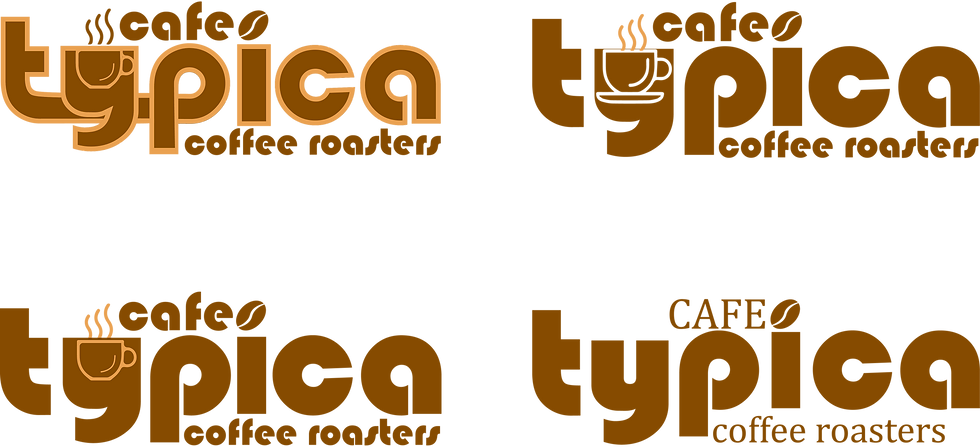
I had a few ideas for what I wanted to do - refine the original logo, make a zoom in of a typica branch, or make it a wordmark? I ended up leaning into the Bauhaus aesthetic for type and shape choices - contrast is key.
Digital Iterations
I had the basic logo down, now I had to experiment with the placement of elements, secondary font, and outline. I ended up choosing a version in all Bauhaus font with an outline, which stood out in both light and dark contexts.
Final Logo
I had secured the final logo - an outlined logomark that creates contrast and emphasizes the “typica” in “Cafe Typica”. A version containing more lines would be used in settings that required more contrast.

Pattern
A pattern is an essential element to any good graphic design project. In Cafe Typica's case, it is a Bauhaus-inspired pattern that combines curvilinear and angled forms from Global Village Coffeehouse as well as the Bauhaus' classic forms.

Environmental
